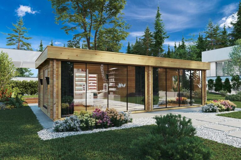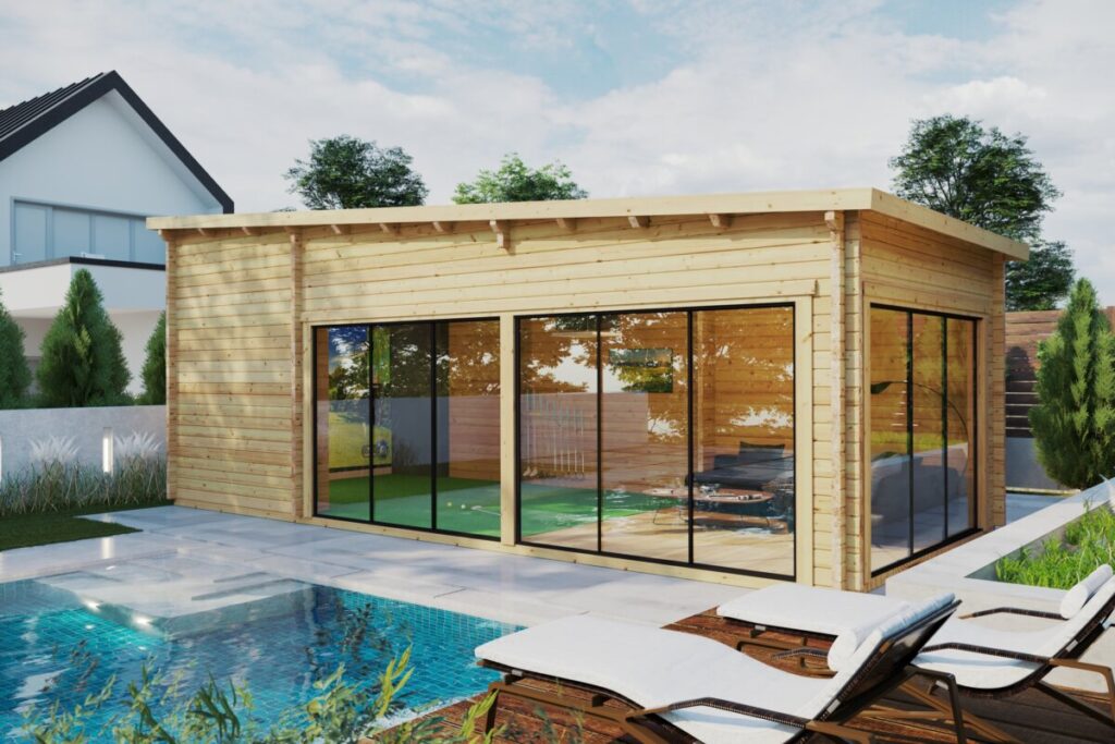
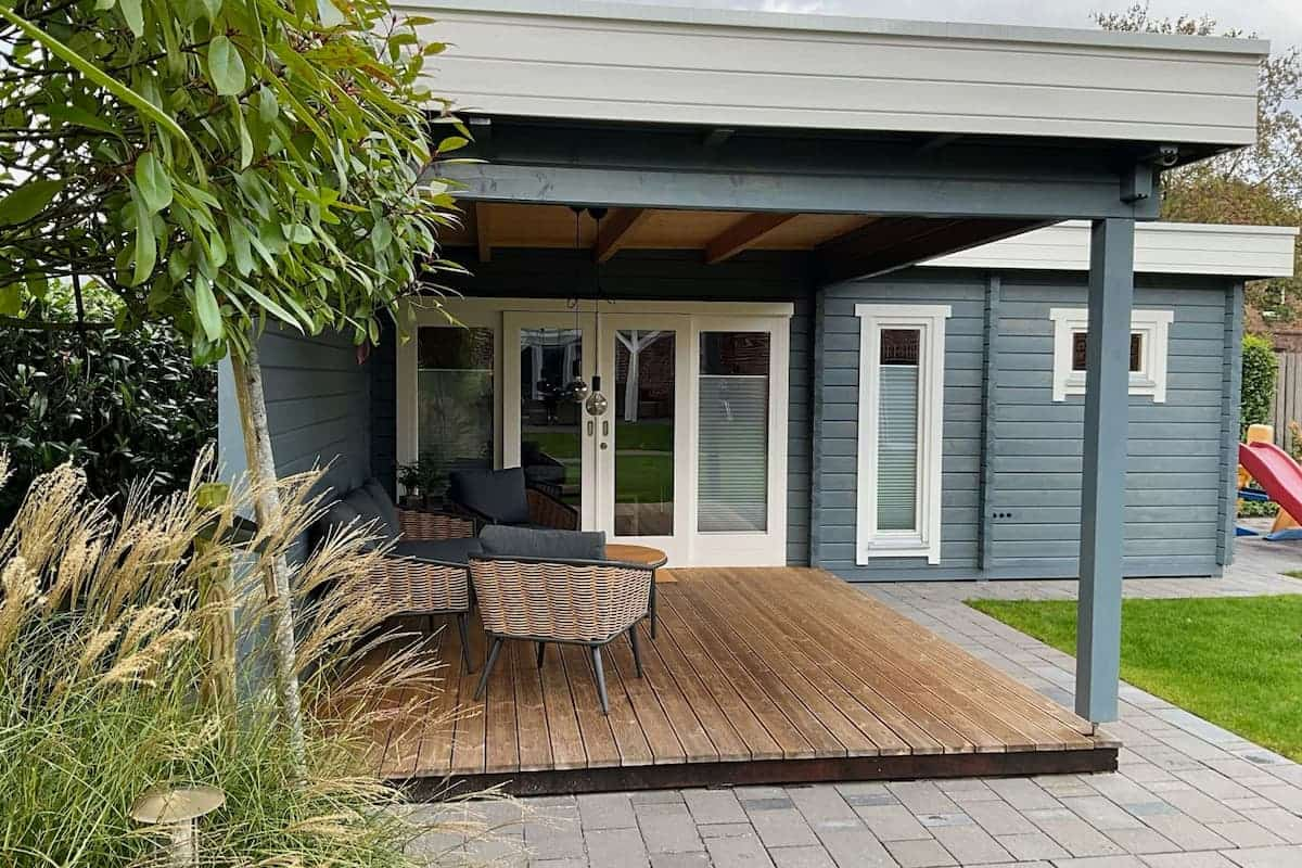
A garden house doesn’t have to be just a boring wooden structure at the end of the garden. It can be anything from a calming hideaway to a productive workspace or a creative studio – with the right interior paint choices!
Colour has the power to change how a space feels, how light behaves, and, most important of all – how often you’ll want to use it.
In this guide, we’ll explore practical paint options, colour psychology, a few inspiring interior styles, and simple techniques that elevate the appearance of wooden walls. With a few tips, you can design a garden house interior that feels intentional, personal, and long-lasting.
Absolutely, and not just for visual appeal.
Interior paint does more than add colour. It also helps protect timber, brightens darker corners, and creates the desired atmosphere you’re after.
Unlike rooms inside your main home, a garden house can give you the freedom to experiment without risking too much or creating unwanted clashes. You can go bold, soft, modern, or rustic without worrying about matching the rest of the house.
Paint also makes the space feel finished, which often encourages more frequent use throughout the year.
Wooden garden buildings experience larger fluctuations in temperature and humidity. This means paint selection matters more than it does for houses lived in year-round.
Paint needs to allow moisture to escape. Non-breathable products can trap dampness, leading to peeling, bubbling, or damage to the wood underneath.
Here are some of the best paint options for the garden house interiors.
Water-based acrylic paints
A reliable all-rounder. These paints are low-odour, quick-drying, easy to clean, and breathable, making them suitable for most garden houses.
Chalk or clay-based paints
Perfect for a soft, matte, lived-in look. They suit rustic, vintage, or shabby-chic styles but should always be checked for wood compatibility.
Interior wood-specific paints
Designed specifically for timber walls, these finishes are durable, wipeable, and ideal for spaces that see frequent use.
What to avoid
Heavy oil-based paints may seem durable, but they often struggle with seasonal movement in wood and can crack or peel over time.
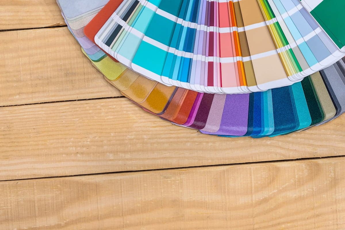
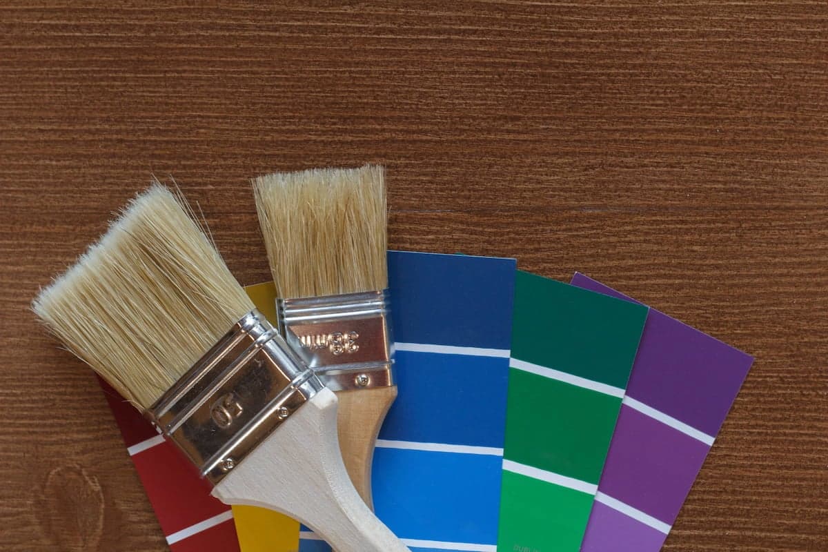
Before choosing a shade, think about how you want the space to feel.
Soft blues, muted greens, lavender, and cool greys create a soothing atmosphere. These colours work beautifully in reading rooms, home offices, or mindfulness spaces.
Terracotta, peach, warm pinks, ochre, and sun-baked oranges bring warmth and energy. They’re especially inviting during colder months.
Warm whites, soft creams, stone, taupe, and greige offer a neutral backdrop that adapts easily to changing décor and seasons.
A colour swatch alone doesn’t tell the full story. Consider these factors before committing:
Purpose of the space
A garden office benefits from energising yet balanced colours, while a relaxation retreat calls for gentle, natural tones.
Natural light levels
Bright spaces can handle deeper colours. Shaded or north-facing garden houses feel larger and lighter with pale, warm hues.
Your personal style
Remember that trends come and go – choose colours you genuinely enjoy living with!
Finish type
Year-round use
Warm colours help spaces feel welcoming in winter, while cool shades enhance summer freshness.
Compatibility with exterior
Interior colours don’t need to match the outside exactly, but a sense of visual balance prevents jarring contrasts.
There’s no single “right” look, only the one that suits your taste and how you use your space. Here are six distinctive styles to spark ideas:

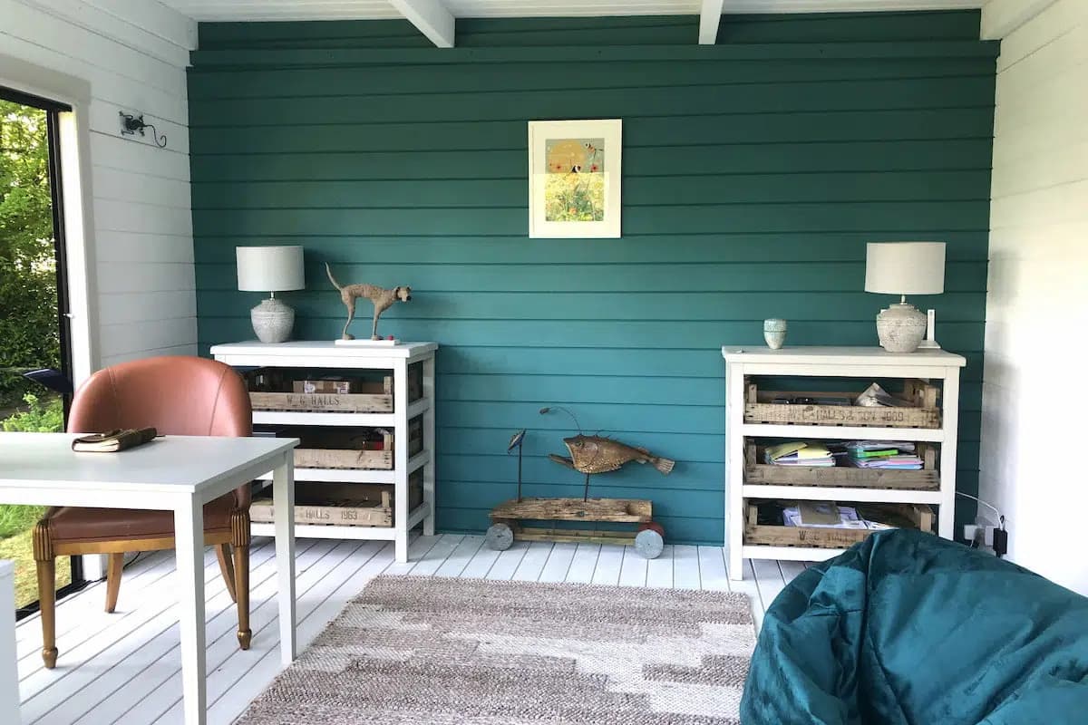
Layer warm neutrals like ivory, oatmeal, and stone with deep accents such as navy or charcoal. The result feels calm, elegant, and hotel-like – perfect for unwinding.
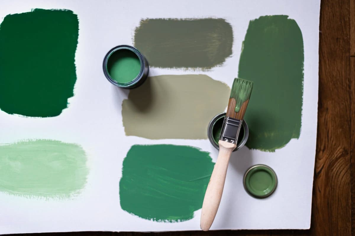
Bring the outdoors in with sage green, pale mint, or soft botanical tones. Pair with white trim, woven furniture, and greenery for a fresh, airy feel.
Inspired by Mediterranean light, this palette blends terracotta, sandy beige, and dusty pink. Natural textures like jute, linen, and rattan enhance the relaxed warmth.

Jewel tones – deep teal, forest green, plum, or muted burgundy –add drama and depth. Use warm wood and soft lighting to balance intensity.
Powdered blues, driftwood greys, and sea-foam greens evoke seaside serenity. Combine with bleached wood and natural fabrics for a breezy atmosphere.
Crisp white or light grey walls with black accents create a clean, contemporary look. Texture is key – think ceramics, woven baskets, and brushed metal.
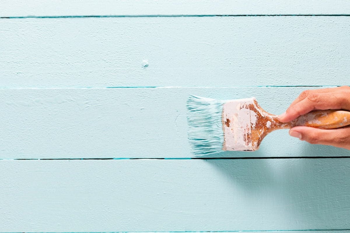
You don’t need advanced skills to create visual interest. There are plenty of guides available online that teach you how to use any of the following painting techniques.
Stencilling
Introduce subtle patterns without committing to wallpaper. In a small space, like a garden house, it’s smart to avoid strong contrast to not overwhelm the room.
Sponge painting
Creates a soft, cloud-like texture – ideal for neutral palettes and dreamy rooms.
Colour blocking
Use contrasting sections to define zones in multifunctional spaces or to create depth or a focal point.
Rag rolling
A classic technique that adds organic movement and depth to the room.
Dry brushing
Perfect for rustic interiors, allowing wood grain to show through for a layered finish.
Here are a few helpful tips to get you that near-perfect finish.
Patience at this stage pays off for years, so take your time and don’t rush it. Enjoy the process!

Here are a few common mistakes that beginners often make. Make sure you read through the list and skip doing any of these!
A thoughtfully painted interior can completely redefine your garden house. Whether you prefer understated neutrals or bold, expressive colours, the right paint choices really can turn a simple garden building into a space you’ll genuinely love spending time in.
Take your time, test your ideas, and choose products that respect the nature of wood. Done well, interior paint isn’t just decoration – it’s transformation and creation.